online specimen
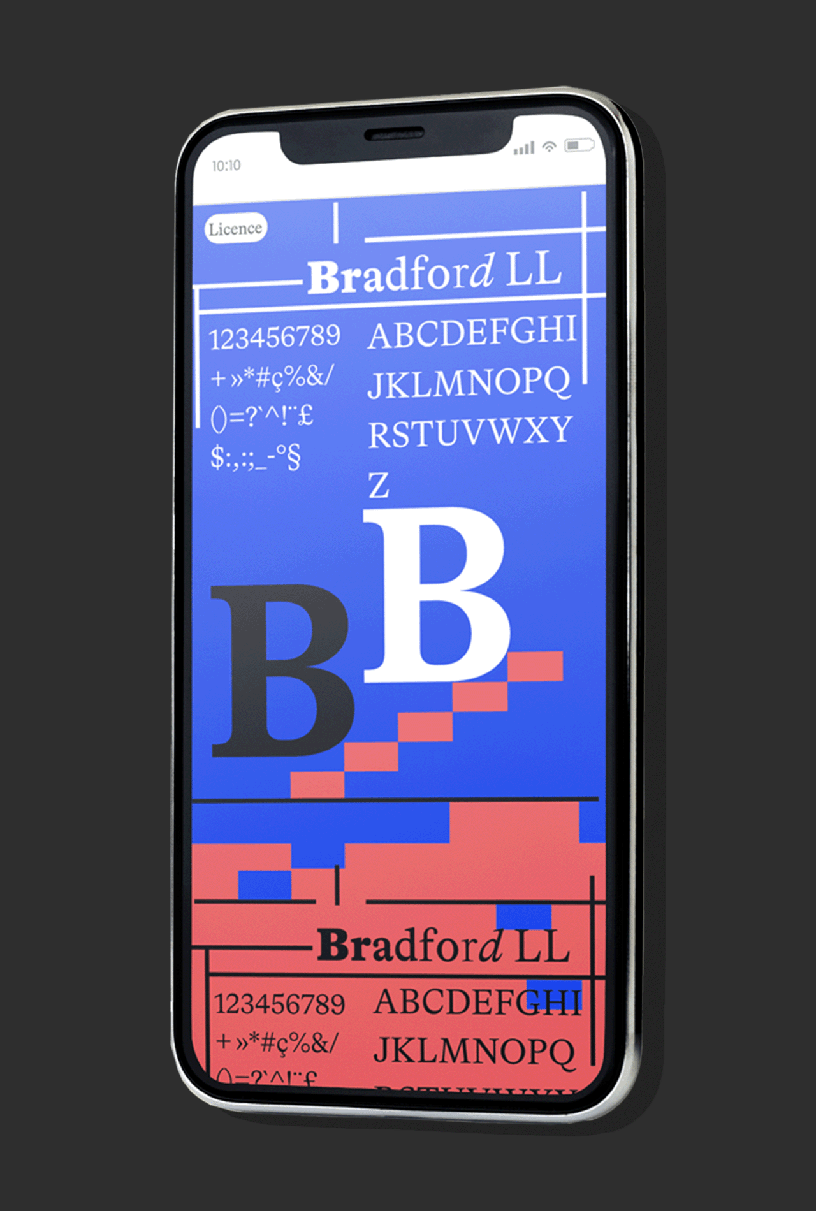
The concept behind this project was to explore creative and impactful ways to showcase the Bradford font, aiming to draw attention and encourage people to purchase it. After considering various options, I ultimately decided to highlight the Bradford font by placing it against a bold, electric blue and vibrant red background. This choice was intentional, as the bright, flashy colors provide a strong contrast, allowing the font to stand out and demonstrate its versatility. Whether displayed in black or white, the Bradford font retains its clarity and elegance, even when paired with intense background hues. This not only showcases the font's adaptability to different design environments but also reinforces its appeal to potential buyers looking for a font that works across various high-contrast, eye-catching visuals. The goal was to convey that no matter how daring or unconventional the color scheme, Bradford can still maintain its professional, stylish presence.